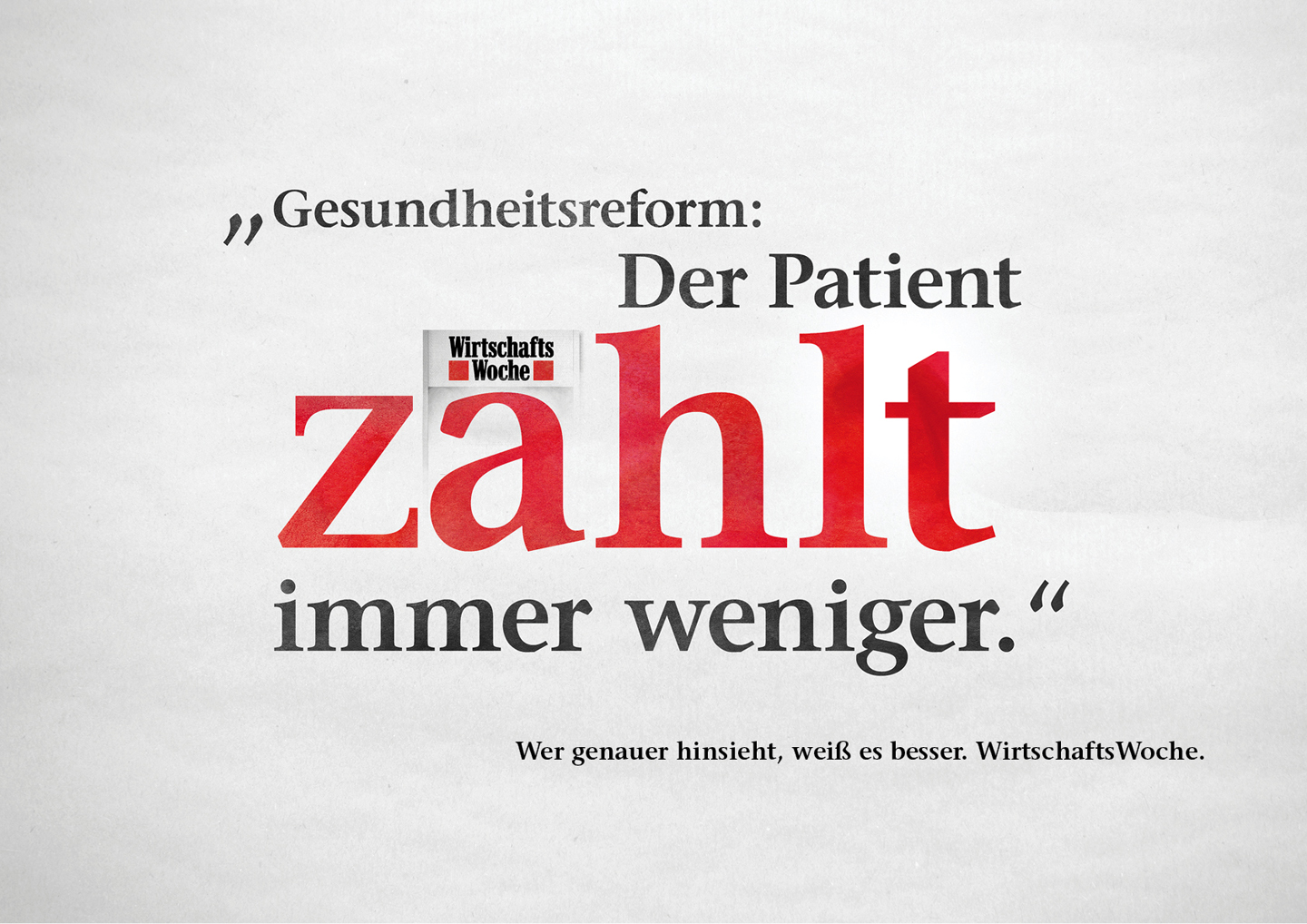
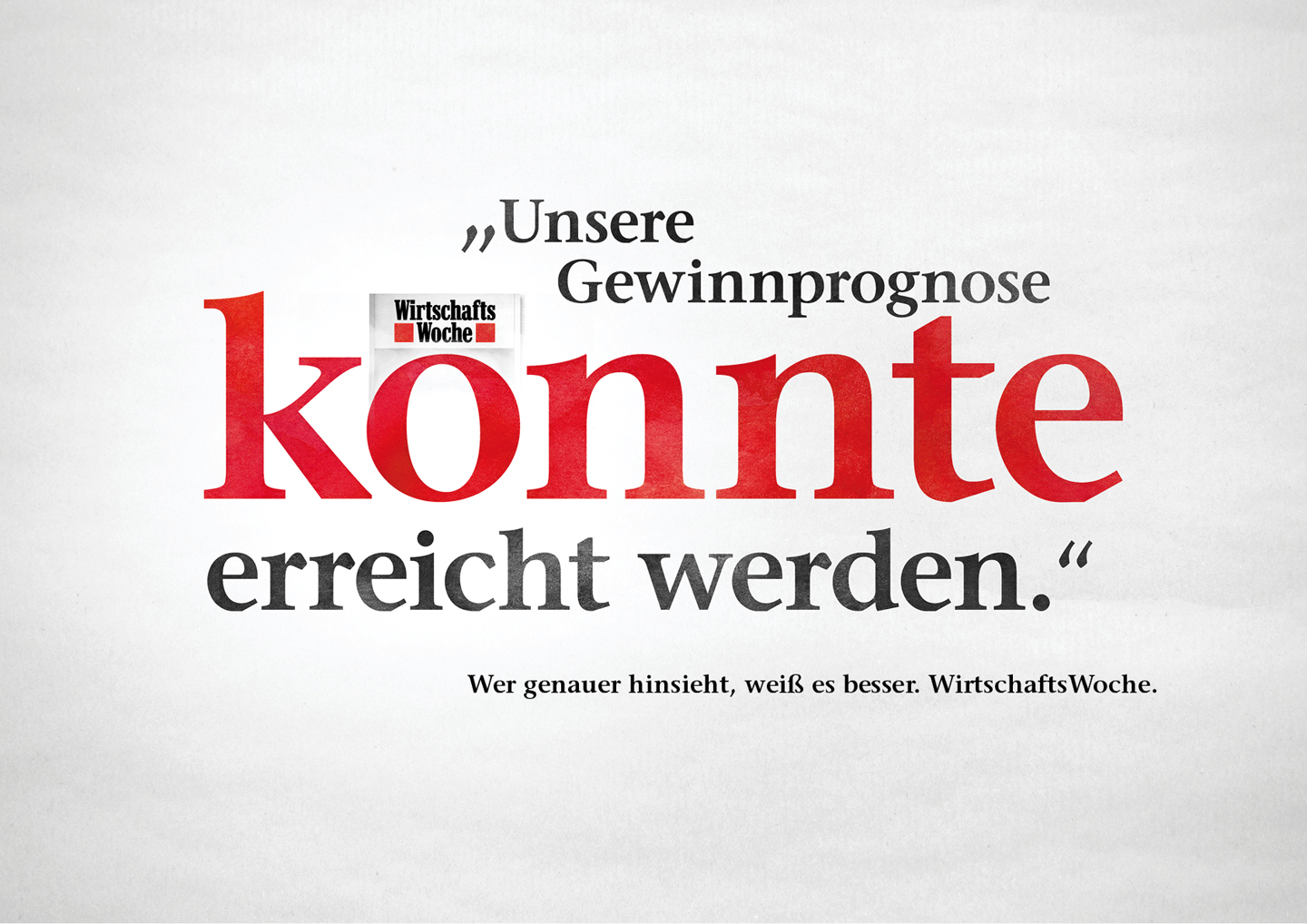
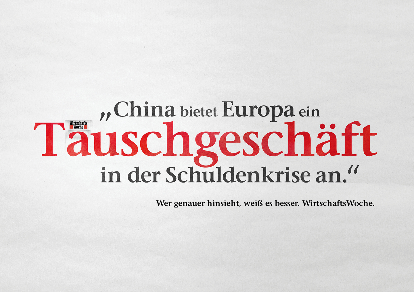
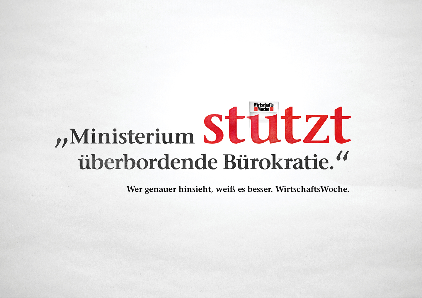
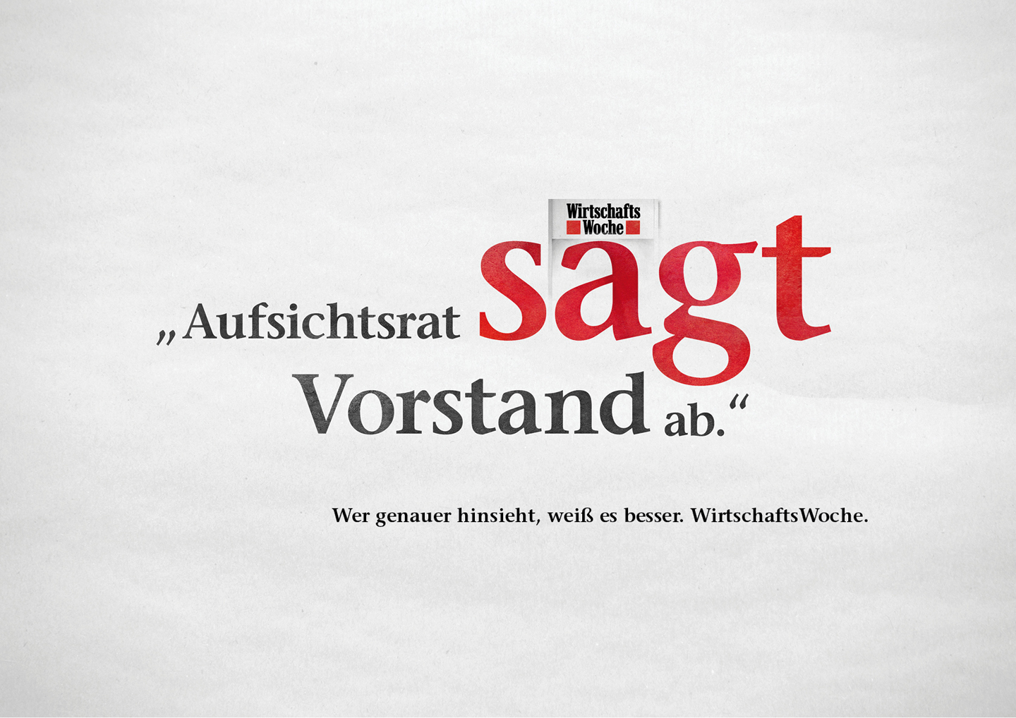
Those who look closer, know better. That’s proven by these headlines where one single umlaut makes all the difference in meaning.
The brief:
WirtschaftsWoche is the leading weekly for all things business.
The campaign aimed to show that the magazine offers the best in-depth analysis. And that its readers know more as a result.
My contribution:
I devised the concept of reinterpreting the two squares in the logo as umlauts. Thereby, the headlines could be read in two entirely different ways.
Awards:
ADC 2018 – Silber, Auszeichnung
Credits:
Copy/ Concept: Julia Lackermayer
Art Direction: Christofer Kümmerer
CDs: Arndt Poguntke, Florian Kitzing